Last month we launched a complete overhaul of our share buttons. Our goal was to simplify the button creation process and give people more customization options.
Using our out-of-the-box options, people with little or no web design experience can create a stunning array of looks to match their site – rounded corners, square corners, circles, squares, and rectangles – just to name a few.
We understand that there are folks out there who need more customization. You say your share buttons need to look like fuchsia kittens playing with colored balls of yarn? I’m happy to tell you that you can do that, and it’s not that hard. Apply a few CSS selectors to our code, and you’re on your way. Exhibit A:
Share This
263Shares
 Share
Share
 Tweet
Tweet
 Pin
Pin
 Email
Email

Since launch, our new share buttons have been configured and installed on thousands of sites. The variety of implementations is nothing short of astounding. Here are our favorite examples of the new buttons in action.
1. Ninamu Resort

There’s nothing fancy about this implementation, but it lends an elegant touch to the luxurious nature of this private island resort. Ninamu Resort added its own call to action above the buttons, but the rest of the options are out of the box. Medium size with no labels, center alignment, and fully rounded corners create the classy circular button shape. motuninamu.com
2. Rebels Market

Similar to Ninamu Resort, Rebels Market’s share buttons were built using out-of-the-box configurations – with one exception. Rebels Market added a single CSS override to the button fonts, matching them to the rest of its site. The result is subtle and stylish. rebelsmarket.com
3. Cow Cow

CowCow has added a few additional customizations into its mix. It took the default small buttons and shrank them down by 8px. It also made the normal state of each channel a consistent uniform grey-to not overshadow the rest of the information on its pages.
4. Nevada Housing Division

The Nevada Housing Division used our sticky buttons as a starting point. With just a few CSS overrides, it was able to create a look that matches perfectly with its unique visual design. homeispossiblenv.com
5. NASA

Pardon me while I nerd out for a second here. NASA put its new share buttons on MARS – or at least its blog about it. It created a clean look by removing the background colors from the share channels and moving the total share count from the left to the right. mars.nasa.gov
How will you design your perfect share buttons? Create a set today!
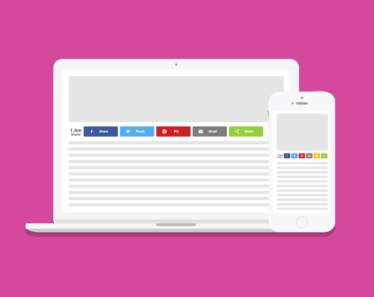
Inline share buttons
Use inline to place buttons at a specific location on a page, such as under headlines.
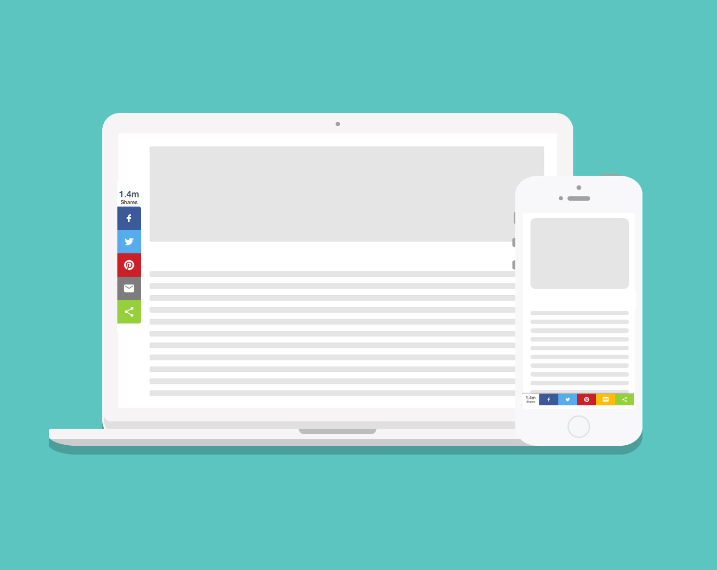
Sticky share buttons
Sticky buttons are fixed to the side of the screen on desktop, and the bottom of the screen on mobile.