

Welcome to the Strategy for Mobile Optimization series in which we share all on mobile! This is part 2 of the series.
Almost every mobile site has some kind of navigation.
In most instances, it is created by scaling down a desktop site and making it responsive. But just because your navigation is built into the responsive design doesn’t mean it’s mobile-friendly and optimized for mobile SEO.
For instance, multi-level menus may deliver a positive user experience for desktop users, but they’re an overkill for mobile sites because they’ll clutter your screen and confuse your visitors.
At its core, mobile navigation should be simple, intuitive, and compact —- with limited real estate available, it shouldn’t occupy too much of the screen. Also, it should allow visitors to quickly find what they want without hassle.
With this in mind, get your brain into gear and use these 4 tips to make visitors fall in love with your mobile website:
1. Use Card Grids
Because mobile users today seek out information quickly, publishers should put together a responsive layout that meets user expectations by using card grids.
Card grids are driving mobile navigation away from walls of text grouped together, towards meaningful excerpts of information aggregated into one coherent experience.
Cards can include text descriptions, images, or both to balance out aesthetics with good usability for your site.
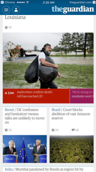
To illustrate: The Guardian serves the latest news stories to its mobile visitors by using a deck of cards. The same navigation could have been achieved with textual links taking up a meagre portion of the screen, but card grids offer a whole new level of interaction beyond just navigation. What better way to display all of your best bits of content together on a mobile-friendly website than with aesthetically-polished shapes?
2. Make the Search Bar Prominent
According to a study by MoovWeb, search bars are displayed more often than search icons on mobile, with 56 percent of mobile sites featuring an exposed search bar. Also, the search bar gets 75 percent more taps when it’s exposed than collapsed.
You should make it convenient for mobile visitors to search your site by placing a search bar in an easily accessible location. Preferably, you want to have the search bar at the top of the navigation menu so if visitors come to your site searching for specific information, they can quickly find it.
Mashable receives a lot of traffic via social sharing. A significant portion of that traffic is made up of mobile visitors who come to the site looking for specific information. To ensure they’re able to easily find the content, Mashable offers a search function at the top right of the screen. Mashable’s search function is easy to spot — make sure yours is too!
3. Include Mobile-Friendly Share Buttons
This may seem fairly obvious; after all, 65 percent of digital media is consumed on mobile, and a lot of social sharing happens on the small screen as well. To make Facebook share, WhatsApp share, and other social media share effortless for readers, consider adding share buttons to your mobile-friendly website – it’s a fool-proof way to engage visitors! And to get more readers to follow our social media profiles, install the Facebook follow button or the Facebook Messenger follow button.
It doesn’t require much effort — share buttons (and follow buttons) like ours are easy to install, highly customizable, and most importantly, mobile-friendly.
Remember: you’re aiming for a smooth, intuitive navigation to enhance visitors’ experience. With our social share buttons you can tailor them to look seamless across all mobile devices.
Just select your social channel, pick an alignment, choose the button’s size, and insert a call-to-action. In addition, you can request a mobile preview to see if the buttons integrate well with your navigation – a bit of tweaking should allow you to achieve harmony.
4. Make Navigation Touch-Intuitive
Did you know the average finger requires about 44 pixels for a precise tap?
On mobile, instead of the pointy desktop arrow, visitors will be using their bigger, somewhat clumsier fingers to navigate the screen. Therefore, your navigation should guide their touch by making it easy to spot elements — make your links and buttons obvious, and include plenty of white space.
It can also be a good idea to incorporate touch feedback into your mobile-friendly navigation. The feedback could be a font change, a progress bar, a color blink, or another subtle cue. This feedback can help users feel confident that they’ve chosen the correct item.
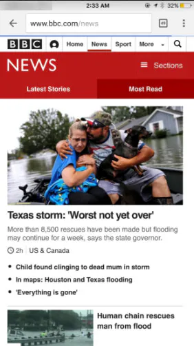
Take the mobile website of BBC News, for instance. When a visitor taps on an item in the navigation bar, it is underlined. This helps visitors know what option they’ve selected, and gives them confidence of selecting the right item. You’ll also see plenty of white space and elements that invite visitors’ touch. Overall, in the minimized environment of a mobile screen, the navigation does a great job in helping people find the right answers.
As mobile devices make up an increasing amount of total web traffic, it’s critical for publishers to make sure that their sites are not only mobile-friendly, but mobile-intuitive.
With some tweaks and enhanced search functionality, you’ll be able to draw in, engage, and satisfy the portion of your user base that interacts with your content on-the-go – all while maximizing your brand’s exposure via share buttons.